Certify

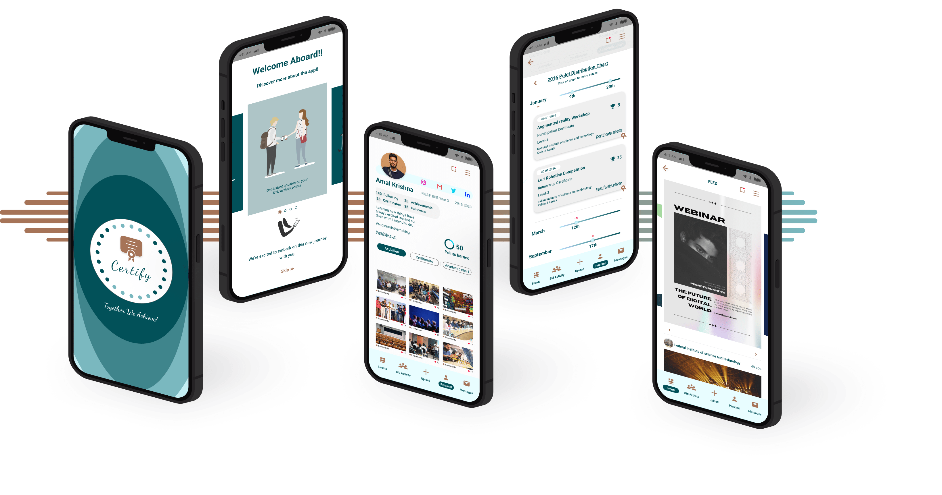
An app for university students and professors to monitor academic activity points and stay updated on workshops and events.
An app for university students and professors to monitor academic activity points and stay updated on workshops and events.
Introduction and background
In the contemporary era, technology has revolutionized daily routines, yet many Indian colleges, including APJ Abdul Kalam Technological University (KTU), are still more inclined to using outdated methods for managing student data. KTU, a UGC and AICTE certified state government university in Kerala, oversees 150+ affiliated colleges with 160,000+ students enrolled in various programs.
Specifically focusing on the undergraduate B-Tech program, (Bachelors of technology) KTU mandates extracurricular activities through activity points. These points, earned through initiatives such as Technical workshops, Entrepreneurship and innovation, Internships, NCC or NSS, Cultural programs, Sports and games, Industrial visits Seminars and lectures and more, contribute to a student’s overall score. To qualify for a B-Tech degree, each student must accumulate 100 activity points, that totals the two credits awarded out of the total 180 credits required for the successful completion of the program and obtaining the degree obtaining the degree. For example, participating in a workshop earns six activity points, and students need to accumulate specific points each year to meet the requirement as described in the KTU Split-up accordingly.
General process followed till now.
- Students submit participation certificates to their faculties, confirming involvement in activities. Professors manually record details like the activity attended, student name, date, and event location.
- Points are allocated according to university-defined categories and activity levels. The university provides professors with a handout detailing point system calculations and subdivisions.
- Following this defined system, college professors input student activity points per semester and consolidate them on an academic-year basis in the KTU portal.
- The prominent issues that were seen
- Professors faced a substantial challenge manually inputting details from 100 to 200 student certificates at the end of each academic year.
- Confusion prevailed about the calculation of points, leaving students uncertain about the process and system definition.
- The absence of a well-organized and managed system was evident.
- Students often missed crucial activities as event promotion primarily occurred on social media, which many KTU students didn’t follow.
Empathise
Aim
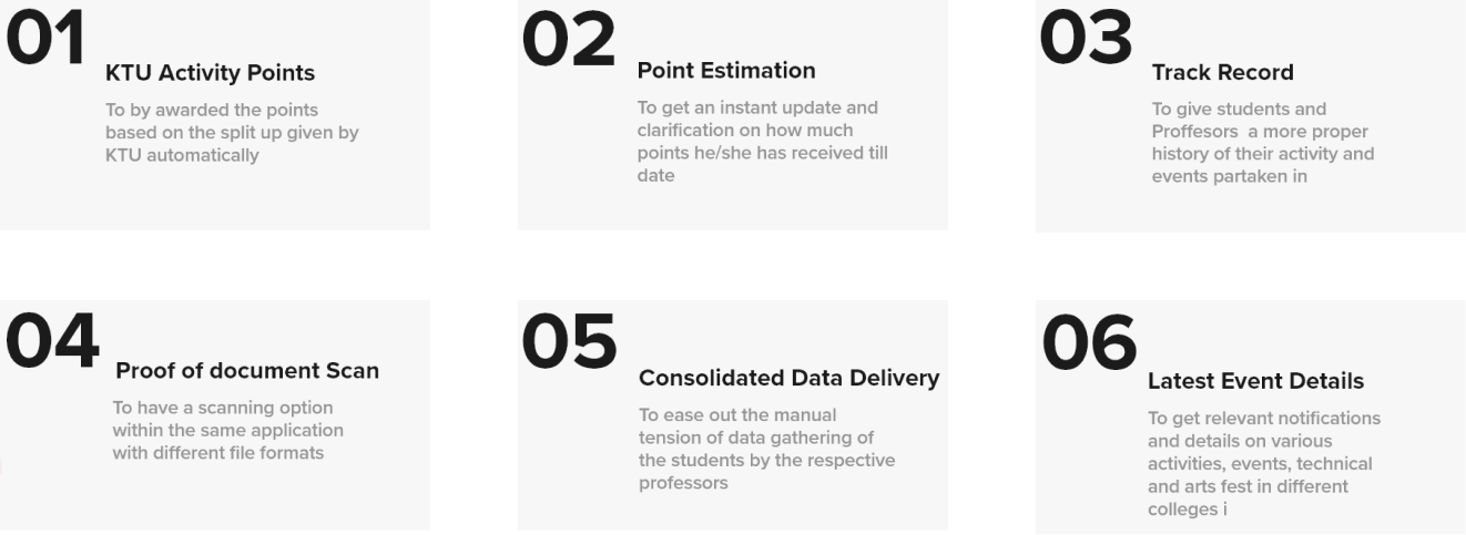
An application that connects students and teachers to assign different activity points respectively to the certificate value for each student and thereby encourages students to participate in events, workshops, and other non-academic activities.
Proposed enhancements and goals for the refined system design:
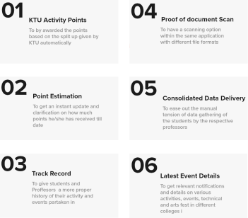
Project Process
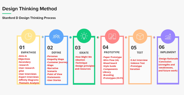
The Stanford D Design Thinking method was used during the entire design development stage. The following techniques and procedures were taken to achieve the intended outcomes and results for this application.
Key User Demographics
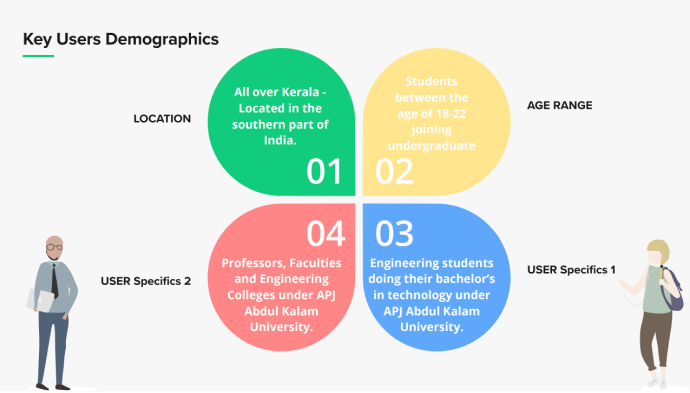
The empathize stage initially identified and targeted key users and demographics. Specifications included user age, location, post-high school degree pursued, and relevant institutions and individuals.
Pilot Mode
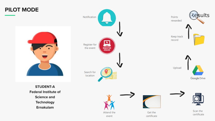
After defining demographics, initial data was obtained through a pilot mode involving an interview with a KTU college student. The current procedure in his institution and his insights into the system were noted, shaping the study based on his comments and feedback.
After defining demographics, initial data was obtained through a pilot mode involving an interview with a KTU college student.
The current procedure in his institution and his insights into the system were noted, shaping the study based on his comments and feedback.
Surveys
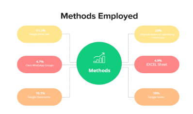
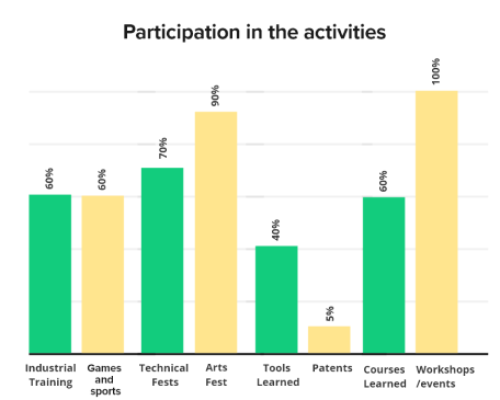
Surveys were valuable in assessing methodologies, student involvement, and engagement levels in the process.
User Interviews
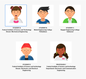
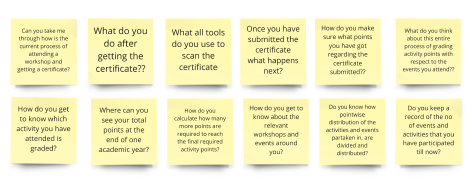
The most relevant responses were used to select five participants from three engineering colleges and also a professor from one of the colleges. Research questions were formulated based on pilot mode and survey feedback. Participants signed ethics forms, and semi-structured interviews were conducted in Malayalam for authenticity.

Affinity Mapping
Data mining was performed once the transcription was received, and the qualitative evaluation of the data collected was analysed using affinity mapping. The quotes and essential remarks were highlighted and listed using post-it notes, and the key insights were obtained, categorised according to colour codes and themes.

Define
Define
Empathy Maps And Persona
After establishing the affinity map, the define stage commenced by creating empathy maps for both students and professors. This involved capturing user perspectives on thoughts, feelings, observations, conversations, and actions. Pain points and gains were integrated alongside the main categorization.
After establishing the affinity map, the define stage commenced by creating empathy maps for both students and professors.
This involved capturing user perspectives on thoughts, feelings, observations, conversations, and actions. Pain points and gains were integrated alongside the main categorization.
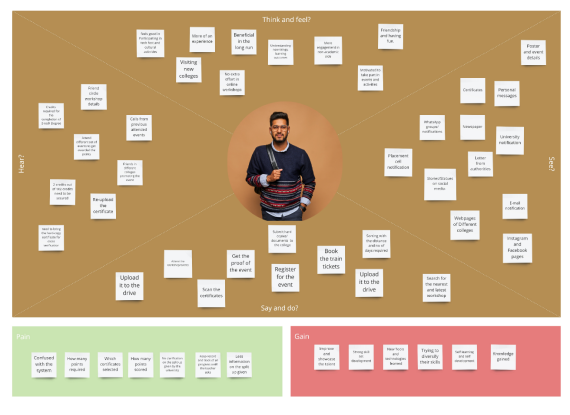
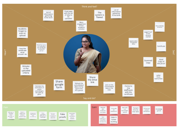
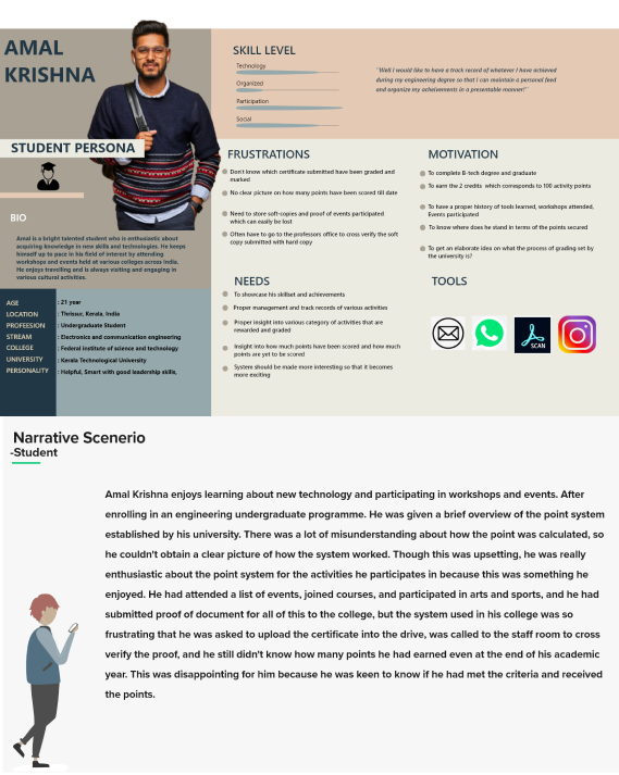
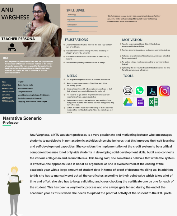
Research points were collated and analysed to create persona for both students and professors, focusing on Purpose/Vision, Needs, Technical aspects, and Motivation. A narrative scenario was constructed to illustrate real-world user experiences, including interpersonal relations, frustrations, motivations, and goal fulfilment.
Research points were collated and analysed to create persona for both students and professors, focusing on Purpose/Vision, Needs, Technical aspects, and Motivation.
A narrative scenario was constructed to illustrate real-world user experiences, including interpersonal relations, frustrations, motivations, and goal fulfilment.
Story board
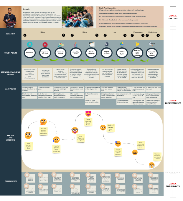
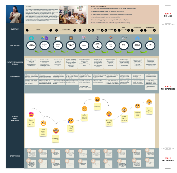
Storyboard and customer journey map depict user interactions at all touchpoints. The process involved creating a timeline of user actions, adding thoughts and feelings for narrative richness, and condensing the story for visualization. Current state customer journey maps for students and professors highlight:
Goals and expectations
Narrative scenarios
Pain points
Touchpoints
Actions
Feelings and emotions
Opportunities
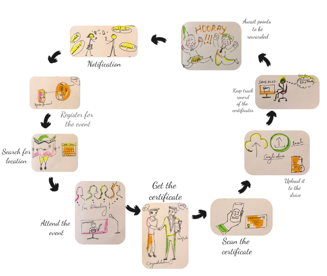
Customer Journey Map
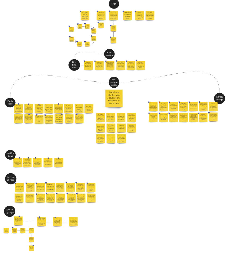
User Stories
User stories were written down and brainstormed based on point-of-view statements. The user stories were separated into the following primary screens as shown below, so that the design and development of different screens could be done methodically when moving on to the prototyping phase.
IDEATE
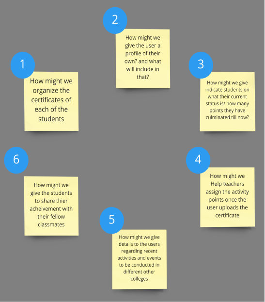
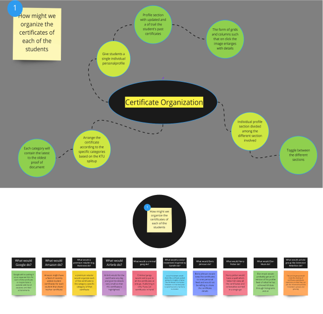
How might we questions?
How might we questions were created based on the POV statements of both the student and the professor and were as follows.
PROTOTYPE
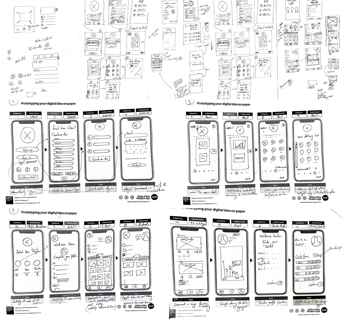
Lo-fi Paper Prototype
Exploratory feedback
On screen 12, the student’s profile feed showed only two sections: workshops and history. Users found it confusing and had difficulty navigating. Additionally, unclear options made it challenging for users to join groups, sometimes requiring guidance from the interviewer.
After the paper lo-fi was finished, it was tested with a few people, and their exploratory input was considered. The following are some of the important topics that were brought up:
Reiteration-
- The tab was divided into three sections: activities, certifications, and track history, providing clarity and conciseness.
- Users could access a detailed track record under the certifications tab, focusing solely on their accomplishments, further refined to academic chart reports and points in the history tab.
- All three tabs are interconnected, so when a user posts a photo with a certificate, it automatically categorizes into activities, certifications, and track history tabs.
Mid-Fi Wireframes
Major Mid-Fi screens developed were as follows-
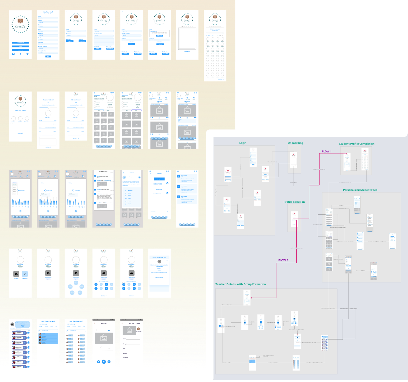
- The Mid-Fi and High-Fi design prototypes were built using the normal iPhone 13-12 pro max as a template, which has a width and height of 428 x 926 pixels.
- The prototyping phase, as well as the prototype artefacts, were carried out using Adobe XD as the primary software tool.
- The “Icons Finder” plugin was used as a source for icon inspiration, and changes were made to it according to the required needs.
Mood board And Branding
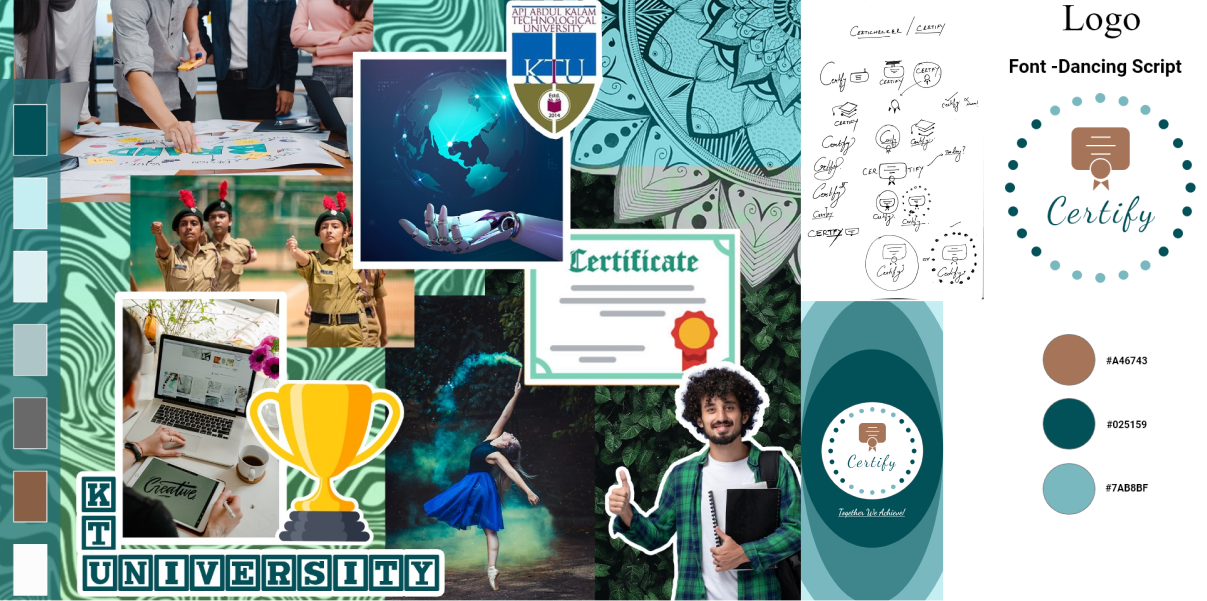
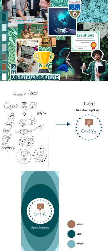
Initially, the brand name was given Certicheker. Later it had been revamped to Certify. The tag line was given as Together we achieve. The initial phases of designing the logo were as shown below.
Style Guide And Components Library
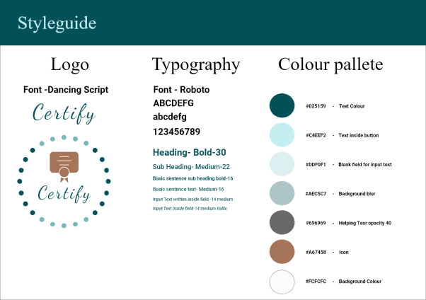
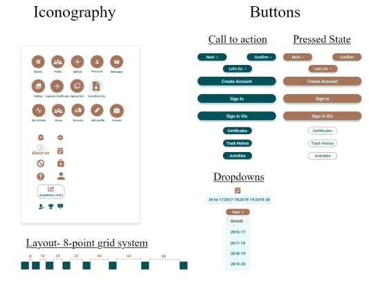
Style Guide And Components Library
Hi-Fi Prototype
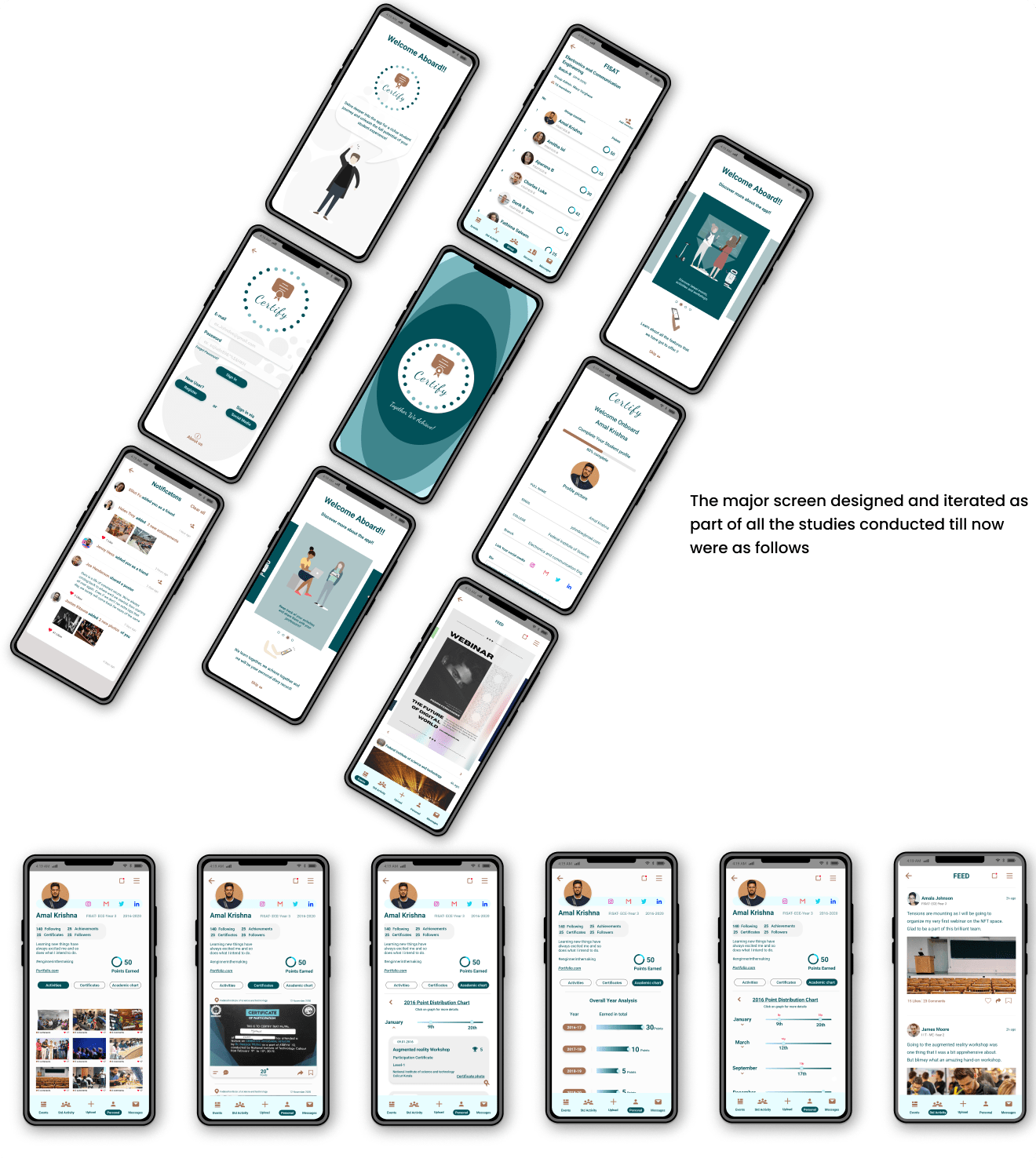
TEST
Valence Test
Three people took part in a valence test, and their useful feedback and insights were recorded. Participants’ input was graded based on the app’s design, what it signified, and what their needs were.
Prototype iteration
Some of the most critical design decisions that were reiterated as a part of the valence test and further study were as follows.
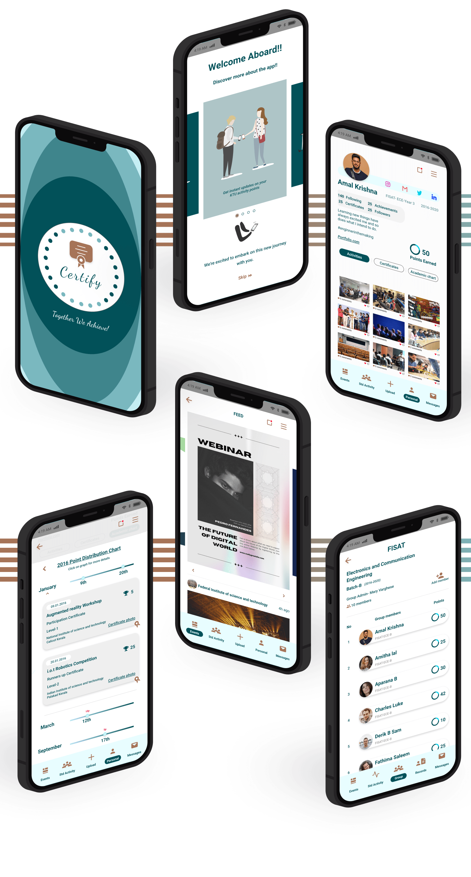
Initially, the personalized student feed focused on aesthetics, but later prioritized maintaining hierarchy for both images and text. The third screen was updated accordingly, presenting clear information in a hierarchical order: starting with the user’s picture, followed by their name, academic details and count and college data (on the right side). In addition to that, the top icons for notifications and settings were considered out of place upon user interaction with the screen.
It was noted that most users follow either the Z pattern or the F pattern:
- Z Pattern: Eyes scan from top left to top right, diagonally down to bottom left, and finally resting at the bottom right when there isn’t much text.
- F Pattern: Users scan left to right along the top, then down the left side for visual cues. They continue scanning left to right when they detect a clue until reaching the bottom.
“My experience as a designer has shown me that deviating from the standard flow that everyone has followed can result in a poor design,”
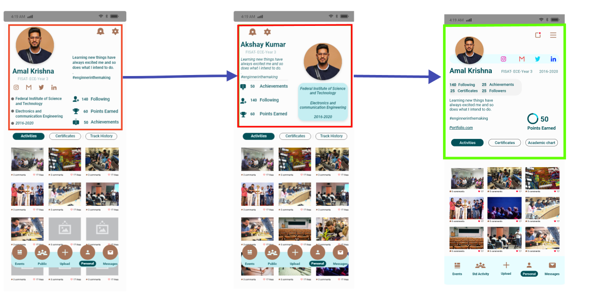
Regarding the initial screen design, there was a significant issue with the organization of icons, text, and images. Despite maintaining proper alignment, the information provided was disorderly and misplaced.
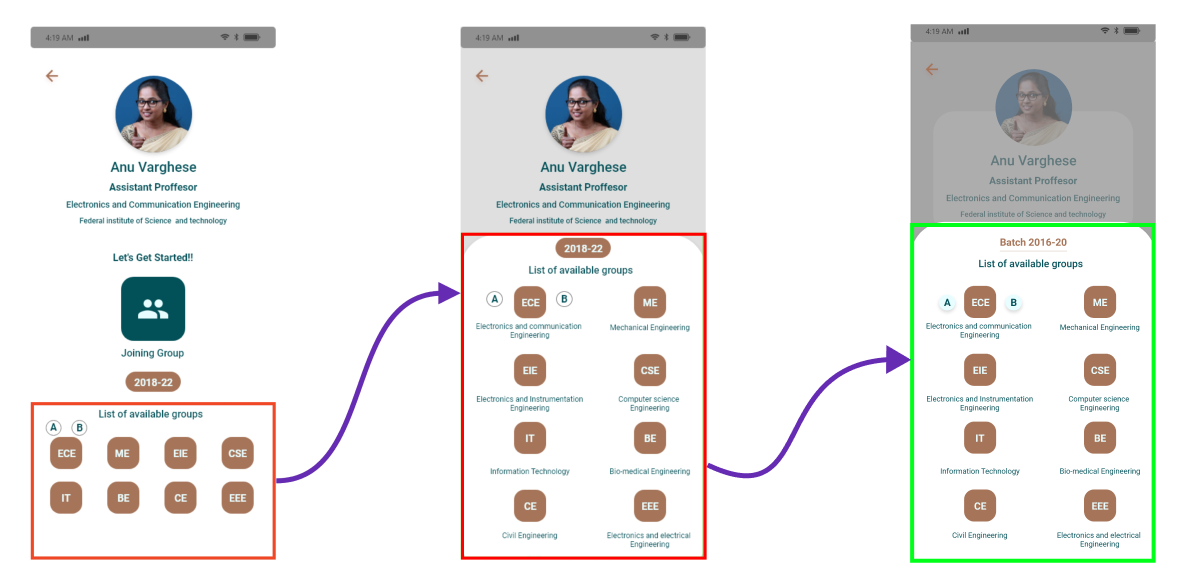
Implications were analysed based on iOS criteria for clarity, deference, and depth. This included ensuring readable text at all sizes, precise and clear icons, subtle and appropriate arrangements, and a strong emphasis on usability in the design. Various design elements such as empty space, color, fonts, graphics, and interface components were utilized to highlight important text and indicate interaction subtly. Additionally, transitions were employed to provide a sense of depth as users navigate through the content.
IMPLEMENT
Strengths
These are the key enhancements integrated into the proposed design prototype, filling gaps present in the current system:
- Providing students and professors with a more accurate activity record tracking.
- Alleviating the manual burden of data gathering for professors.
- Instant updates on the total points received by students.
- Relevant notifications on nearby colleges’ activities and events.
- Access to comprehensive class results and points for professors.
- Incorporating scanning functionality for various file formats within the same application.
- Automatic allocation of points based on KTU’s breakdown.
- Notifications about college festivals across Kerala.
- A platform for sharing and celebrating students’ achievements.
- Personalized student profiles, which can be made public or private.
Weaknesses
Initially, there was consideration for integrating OCR technology into the proposed system, but it couldn’t be pursued due to time limitations. This feature aimed to enhance usefulness for students by automating point calculation through text and image recognition.
Additionally, while initially, only two personas were created (student and professor), a new persona emerged during the user story design phase: “institutions” under the profile category. Developing this profile could have fostered stronger relationships among students, teachers, and institutions.
Future Works
Initially, there was consideration for integrating OCR technology into the proposed system, but it couldn’t be pursued due to time limitations. This feature aimed to enhance usefulness for students by automating point calculation through text and image recognition.
Additionally, while initially, only two personas were created (student and professor), a new persona emerged during the user story design phase: “institutions” under the profile category. Developing this profile could have fostered stronger relationships among students, teachers, and institutions.
With the evolution of the third persona and having the current data in hand, the user stories that were a part of the institutions were further developed, and these were as follows:
As a user, I should be able to
- Upload the event poster or post the event created
- Enter the details of the event scheduled
- Show the event price
- See the list of students registered
- Manage my payment gateway
- Have a page of my ownMy posted poster should be notified for people following me
- Share, comment and like option for my post
- Upload a summary and maybe a video and another related photo of the event
- Have an option to specify the activity point of the event.
Since the application was intended for colleges across Kerala, a formal face-to-face meeting with university staff and institution heads was also required. This would have set the way for further defining the conception and implementation of the third persona. Because of the time and location constraints, this was deemed to be implemented later, as it required a fresh start from the beginning.
From the empathise stage until the conclusion of the implementation stage, the entire process was brand new. A great deal of useful information and insight has been collected, which will undoubtedly be useful in the coming years. It had been enjoyable, engaging, and thought-provoking to design an application in a systematic order. Many alternatives were examined and studied as the process progressed, and a lot of brainstorming was done during each stage, which further enhanced the thinking capacity to answer the situation at hand.


