Whatscookin
Chefs and shops on the go
A platform to uplift small-scale business owners and entrepreneurs
mainly involved in the food industry

A platform to uplift small-scale business owners and entrepreneurs
mainly involved in the food industry
Introduction and background
Introduction and background
During the worldwide Covid pandemic lockdowns, many individuals making societal contributions, like home bakers, gained attention. While they previously catered to friends and family, they shifted to providing essential treats for office workers, students, and families during lockdowns. Concerns about healthful, tasty baked goods became irrelevant as these entrepreneurs continued filling orders post-lockdown. With growing demand for home-cooked meals, many expanded their hobby into a business, serving a broader audience. This trend had seen increased participation, particularly among small-scale businesses, and examples of thriving ventures post-pandemic were evident.
Research, taking feedback, interviewing, going through the statistics and keeping all this in mind, the initial intention was to involve all the small-scale businesses into one single platform, such as
- · People who earn an income through catering services, apartment to apartment, or location-based – regional and cultural food sharing
- · Donuts, pizzas, cakes, brownies, and other snack items are famous among homemakers who enjoy cooking and baking for a profit.
- · Localised small-scale entrepreneurs who have a brand identity with a small section of the audience in terms of the masala, spices mix and oils that they sell.
- · Local grocery stores and vendors are experiencing losses in terms of customers visiting the stores and major players in the market due to their lack of engagement with the improved technical knowledge in this digital world.
Initial plans aimed to bring various small-scale businesses onto a unified platform, including caterers, home bakers, local food producers, and grocery stores. Collaboration with delivery partners and suppliers was also considered to ensure smooth operations and resource accessibility.
Aim
An app that assists small-scale business owners and entrepreneurs who want to maximise their access to their targeted audience in establishing a well-thought-out business plan, providing suitable services to the communities they have built, and is primarily localised to the target industry of food.
Amid the global lockdowns caused by the Covid pandemic, individuals making societal contributions, like home bakers, gained attention for their essential role. From serving friends and family, they transitioned to providing treats for office workers, students, and families during lockdowns.
As demand for home-cooked meals grew, many turned their hobby into a business, catering to a wider audience. This trend saw increased participation, especially among small-scale businesses, with thriving ventures emerging post-pandemic. Initial plans aimed to unite these small-scale businesses on a single platform, encompassing caterers, home bakers, local food producers, and grocery stores.
Collaboration with delivery partners and suppliers was envisioned to ensure seamless operations and resource accessibility.
Aim
An app that assists small-scale business owners and entrepreneurs who want to maximise their access to their targeted audience in establishing a well-thought-out business plan, providing suitable services to the communities they have built, and is primarily localised to the target industry of food.
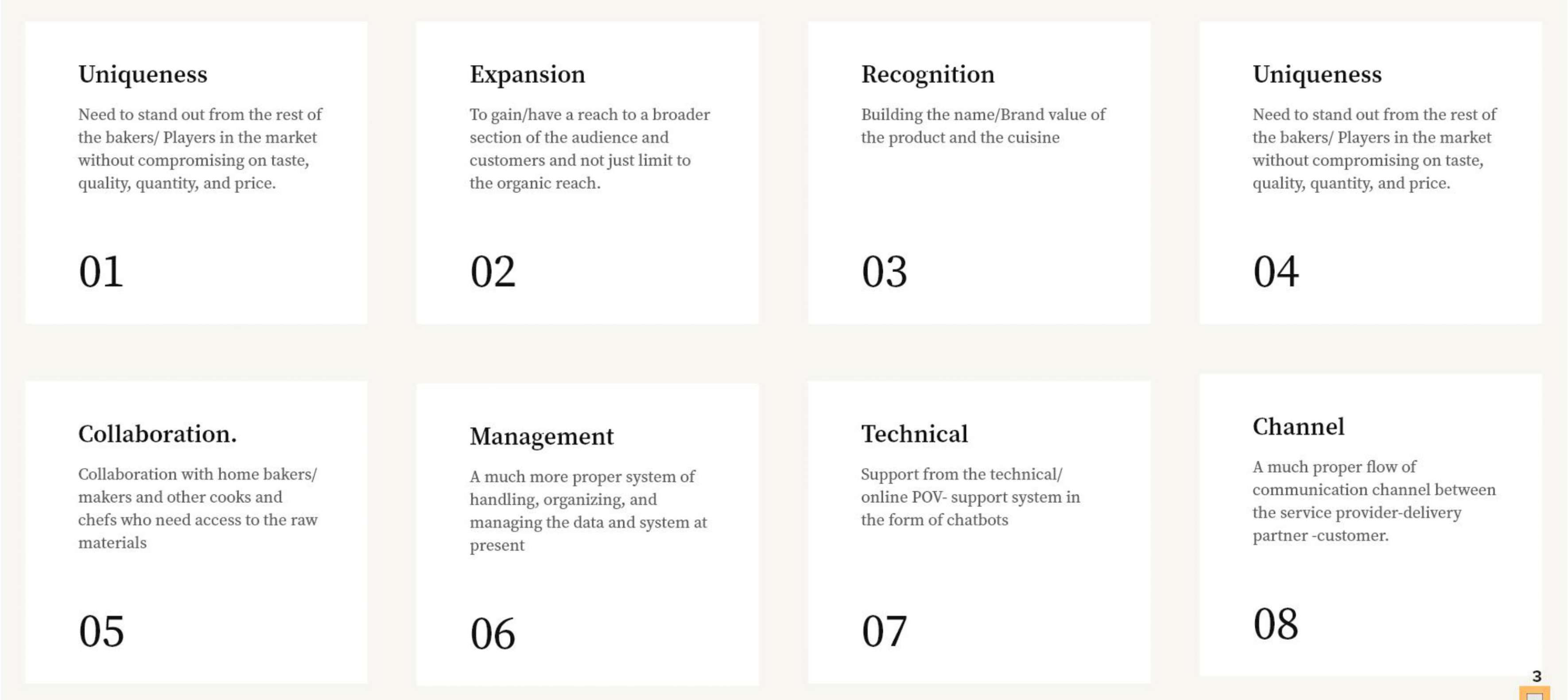
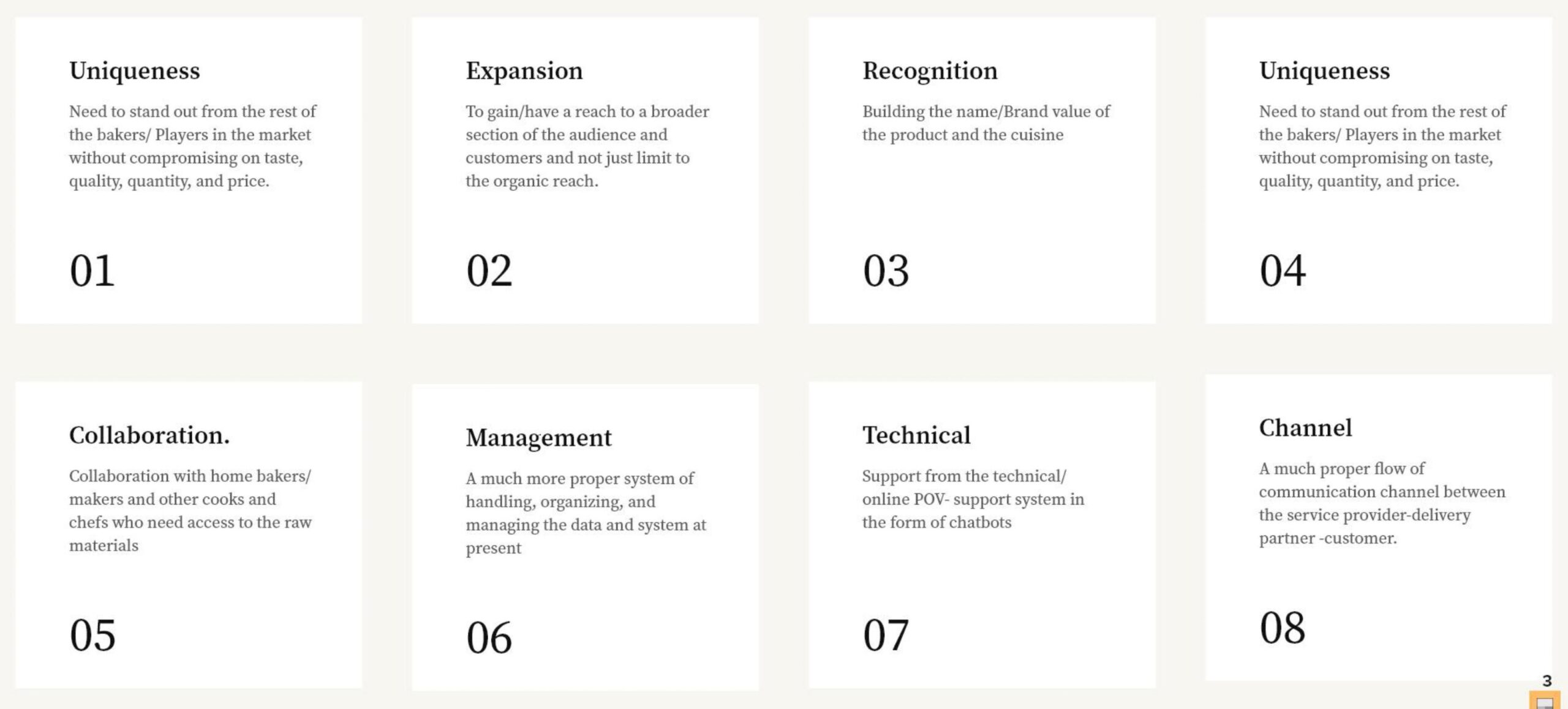
Objectives
Project Process
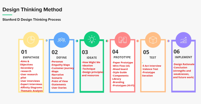
This project was developed using the Stanford D Design Thinking method, and these are the steps that were performed to attain the ultimate results and goals for this application.
EMPATHISE
User-specific characteristics and location dynamics.
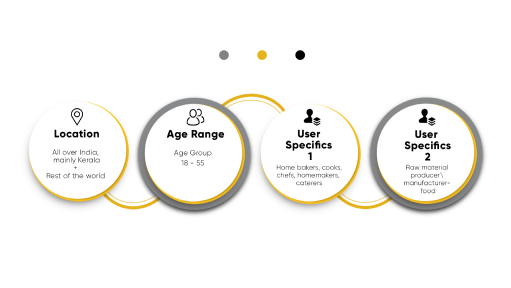
User-specific characteristics and location dynamics.
Homemakers/cookers and raw material producers were the key target users in the research methods.
Pilot Mode
The project was initially conducted with the help of surveys and a pilot mode. Surveys helped understand the dynamics of how people were oriented in this type of business and how much they were involved in the process of food making.
More than the surveys, the most beneficial method was through the pilot mode, where people from all walks of life doing different jobs were called and conversed on these aspects of food cooking. Contacts were obtained from their close kins, families and friends.
The project was initially conducted with the help of surveys and a pilot mode.
Surveys helped understand the dynamics of how people were oriented in this type of business and how much they were involved in the process of food making.
More than the surveys, the most beneficial method was through the pilot mode, where people from all walks of life doing different jobs were called and conversed on these aspects of food cooking. Contacts were obtained from their close kins, families and friends.
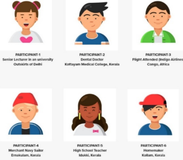
Out of all the people conversed with, seven were selected for further discussion so that more accurate data could be collected.
Their location specifics and job details were as follows.
User Interviews
User Interviews
Participants were given the ethics forms to sign, and a specific time and date were decided for the interviews; thus, the process was scheduled accordingly.
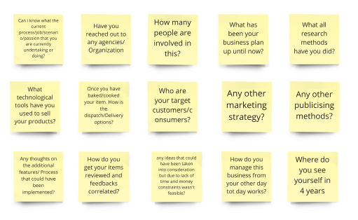
Semi-structured interviews were preferred, and the research questions were formulated below.
Affinity Mapping
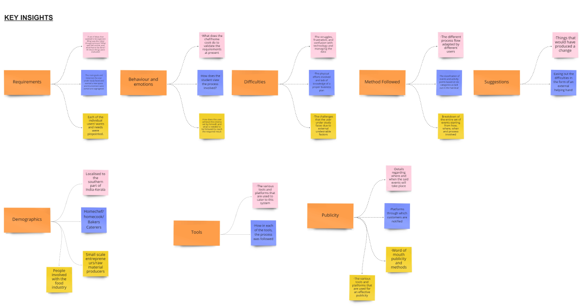
Once the transcription was obtained, data mining was carried out, and affinity mapping was used to analyse the qualitative assessment of the gathered data.


The mapping was based on eight underlying factors that included
- · Demographics
- · Goals
- · Behaviour and
- emotions
- · Method Followed
1. Current procedure
2. Mode of delivery - · Difficulties
- · Publicity
- · Suggestions
- · Tools used
DEFINE
Empathy Mapping
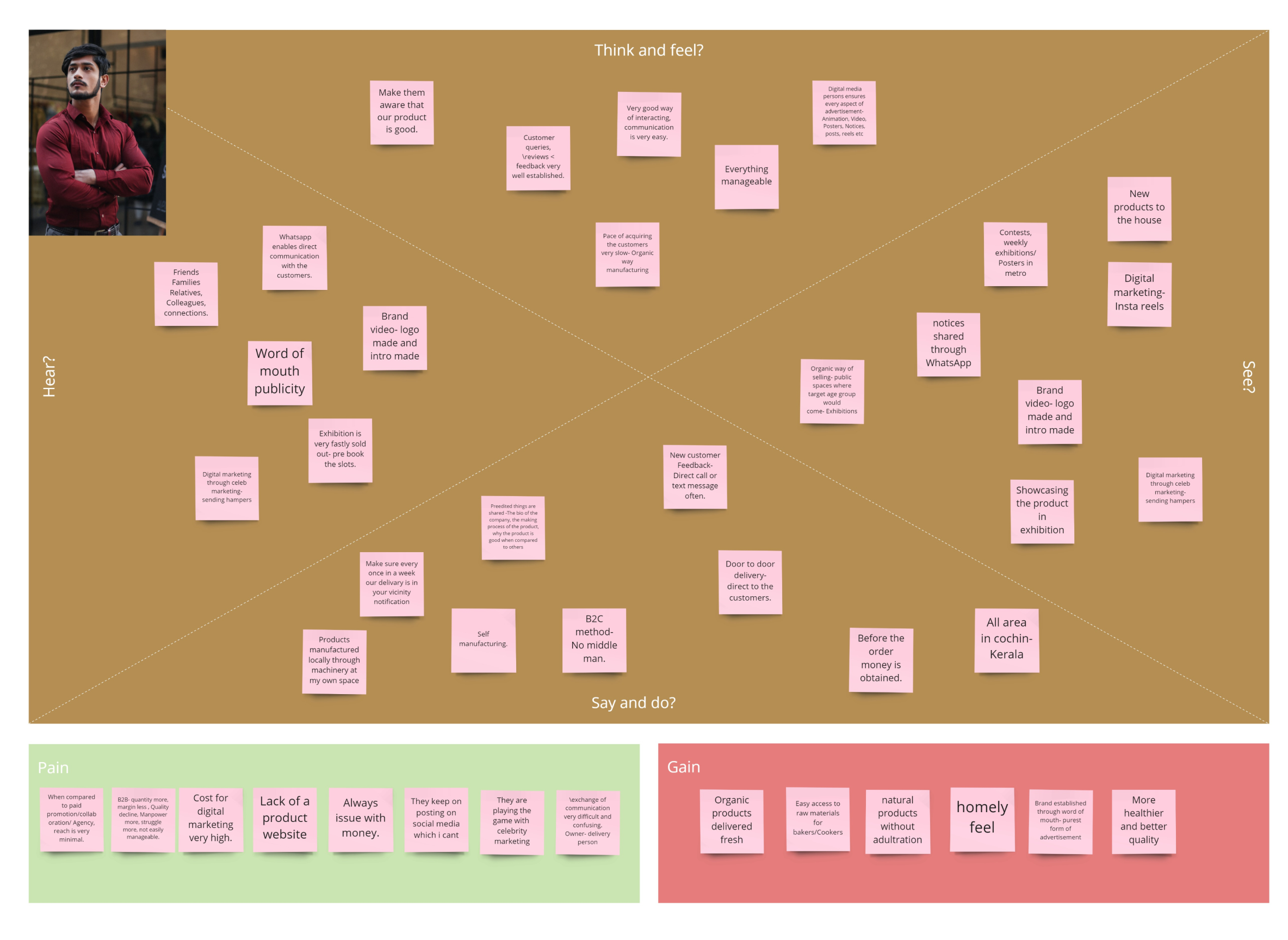
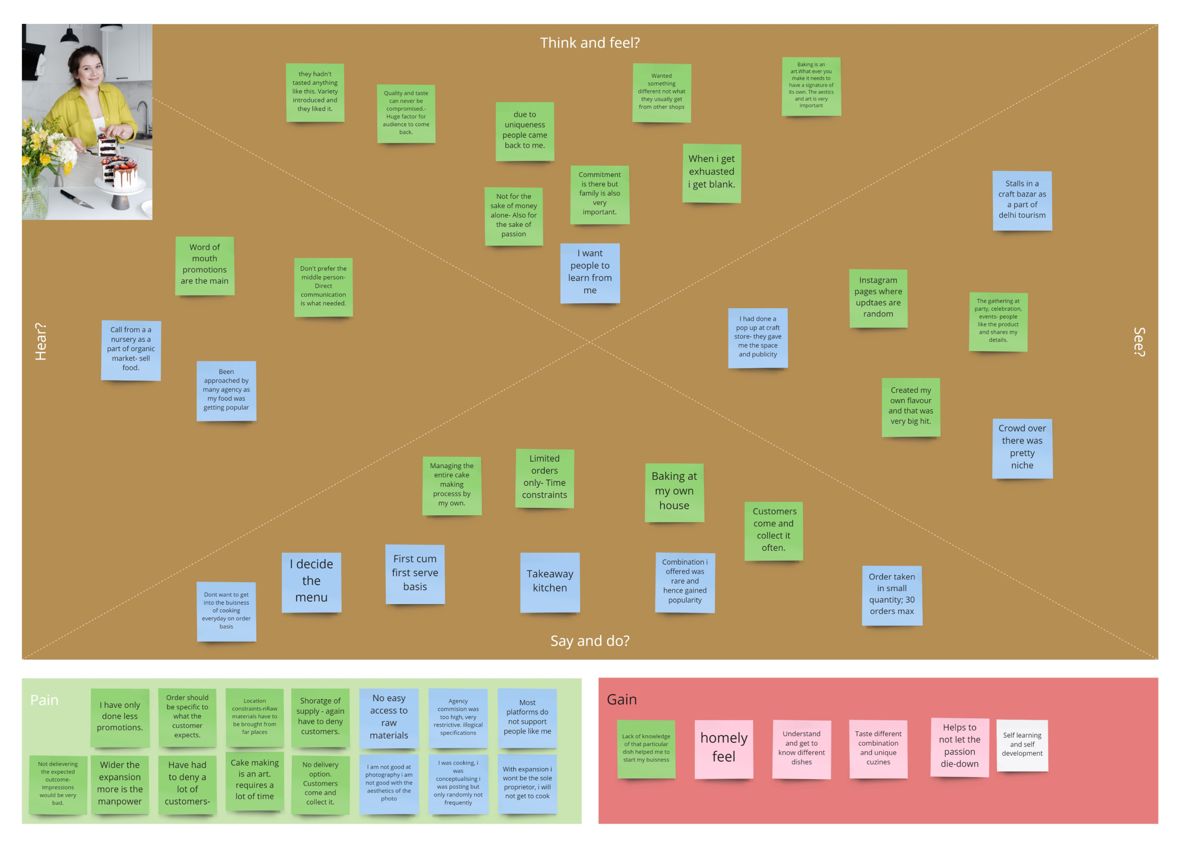
Once the affinity map was established, defining the solution was taken into consideration, and hence the define stage started with the creation of the empathy maps by bringing everything together for both the Homemaker/cooker and raw material producer.
This was described based on how the user thinks and feels, sees, hears, says, and does.
In addition to the main Categorization, the pain points and gains were also included.
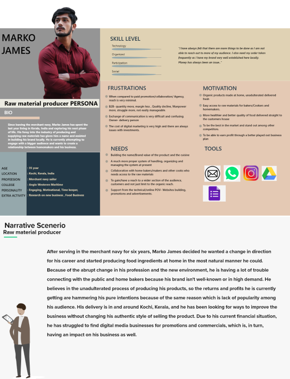
Personas And Narrative Scenarios
Personas And Narrative Scenarios
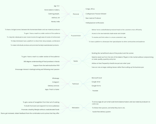
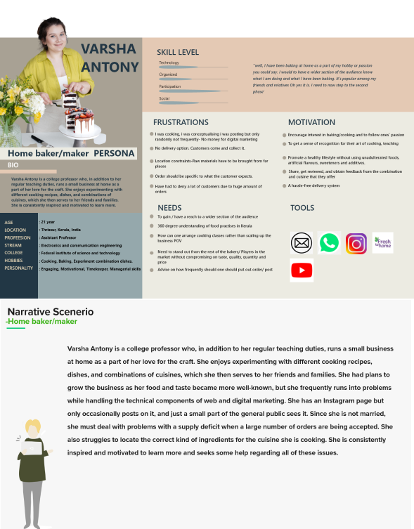
To develop the personas, the overall findings and assertions from the research were compiled, examined, conceptualised, and aligned under the following important considerations.
- · Personal
- · Purpose/vision
- · Needs
- · Technical
- · Motivation
Story Board
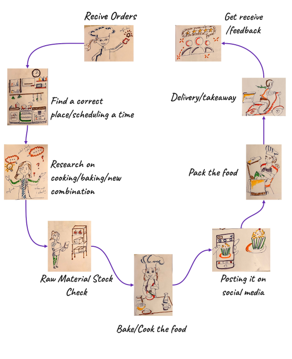
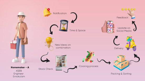
To visualise a story in the form of a storyboard, a linear series of drawings was arranged together to show the steps a home cook would take on a regular basis.
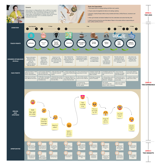
Customer Journey Maps

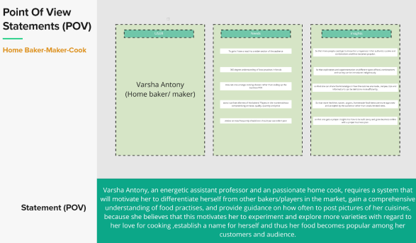
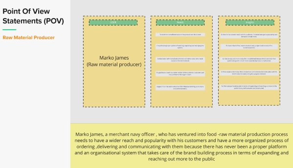
Point of view statements
User Stories
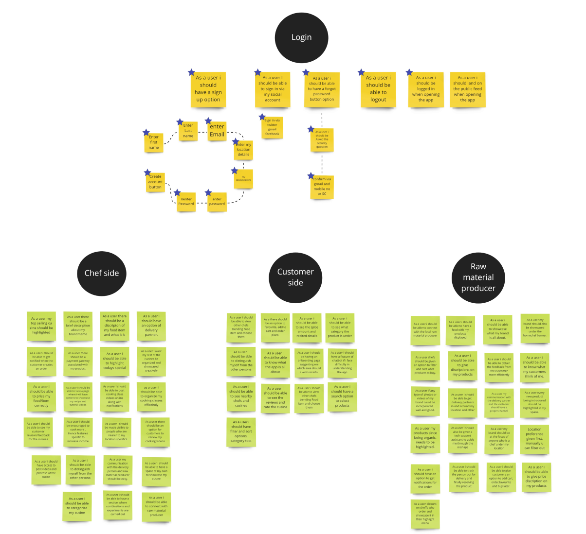
User stories were created to determine how much of the application should be developed to support the concepts of what is helpful to the user. The basis of what should be included upon the start of the application and how it should aid the user under study was carefully considered and brainstormed.
Perspectives from the raw material producer, home chef and the customer side were considered, and the needed features and requirements were iterated in the form of ‘’as a user I want..’’
Competitor analysis
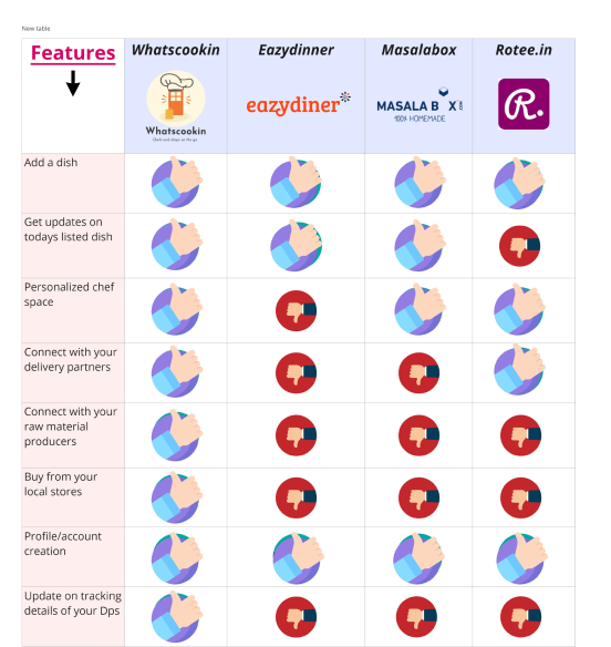
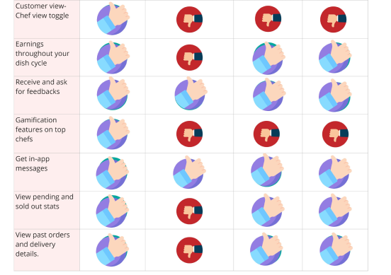
Whatscookin was an app made specifically to assist home chefs and cooks in getting a sense of, tracking and managing their regular dishes and meals. Because most of the rivals in this space had apps that offered the customer point of view and few chef’s view options, the app was structured more like a dashboard cum data management app.
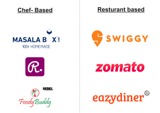
These are some of the famous and well-known food tech start-ups that are establishing themselves in the market at present.
Resources and Design Principles
- A consistent user interface has been prioritised, providing information to users to aid them in completing their jobs rather than forcing users to struggle to recall how to use the product’s capabilities. End-users can therefore rely on recognition rather than recollection. (Lijauco, 2022)
- Users’ cognitive load has been maintained to a minimum to enable speedy and efficient completion of task-specific actions. A simple layout has been utilised, with more emphasis on visual signals than on information.
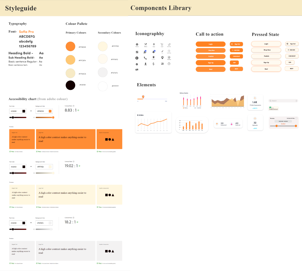
- Accessibility has been considered based on the colour scheme developed from the mood board using the Adobe colour wheel. This has been analysed and used in inclusive design.
- The font size has been kept at a consistent 10-point length or above, and the line spacing has been marked as close as feasible to an 8-point grid system.
- A carefully designed onboarding screen has been created so that users can get a general understanding of the application’s features and functions. To make sure the onboarding process is quick and straightforward, key features and information have been provided in cards.
- The design ideas used in UX studies, such as scale, visual hierarchy, contrast, balance, and gestalt principles, have been closely examined.
- When users stray from the application’s significant features, they will be reminded to read vital information or, if they have already done so, will be forced to return to where they were.
- The application’s layout has been thoughtfully maintained throughout, ensuring that the user’s primary goal is not compromised.
Card Sorting
In this project, Closed Card Sorting was utilized, where participants were provided with the names of objects and their corresponding categories. They were tasked with grouping each item into the category that best fit it. Biases may occur due to the predefined categories available for organizing the cards, impacting the accuracy of information organization.
The card sorting procedure was conducted remotely with 10 participants using optimalworkshop.com. Participants received a summary of the session and instructions on how to group the cards.
Twenty cards were created and organized into six sets of categories. Participants were then sent a link to begin the exercise via email.
In this project, Closed Card Sorting was utilized, where participants were provided with the names of objects and their corresponding categories. They were tasked with grouping each item into the category that best fit it.
Biases may occur due to the predefined categories available for organizing the cards, impacting the accuracy of information organization.
The card sorting procedure was conducted remotely with 10 participants using optimalworkshop.com. Participants received a summary of the session and instructions on how to group the cards.
Twenty cards were created and organized into six sets of categories. Participants were then sent a link to begin the exercise via email.
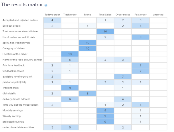
The categories included
- · Today’s orders
- · Track Order
- · Menu
- · Total sales
- · Order Status
- · Past Order
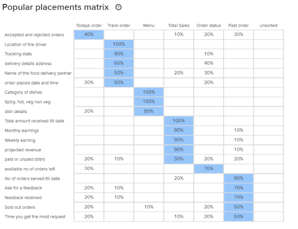
Popular Placement matrix
This table shows the percentage of participants who correctly classified each card. It attempts to recommend the most popular groups based on the highest placement score for each unique card.
Lo-Fi Paper Prototype
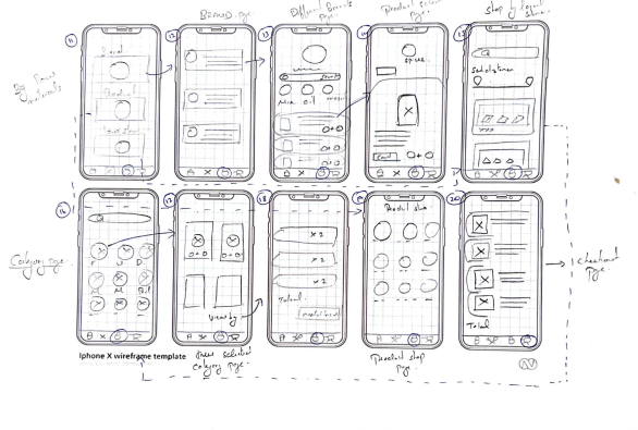
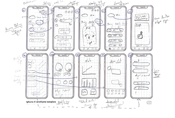
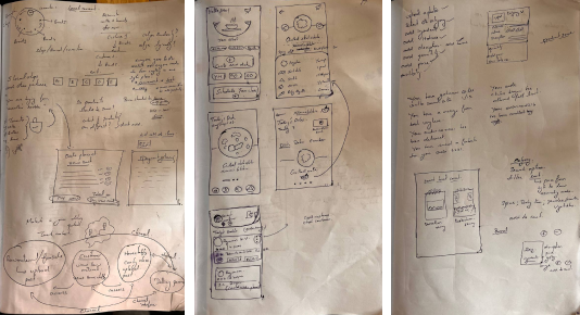
User Flow
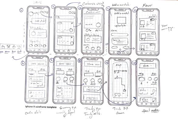
Diagrams of user flows are essential for understanding user experience. They help in understanding how people interact with the application and the steps they take to finish a task or reach a goal on it. Thus, it better serves the user’s demands and provides a more significant user experience.
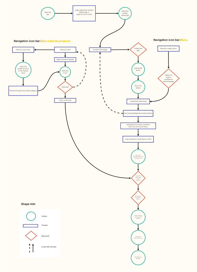
Action: The circle depicts the steps customers take when navigating a product to finish a job from start to finish.
Screen: Rectangles symbolise the screens of digital items that users will see while completing tasks.
Decision: Diamonds represent the decision users make in the user flow where users must ask a question and decide.
User Flow Direction: Lines with arrows tie everything together. Solid lines indicate forward direction, and the dotted lines indicate backward direction.
Mid-Fi Wireframes
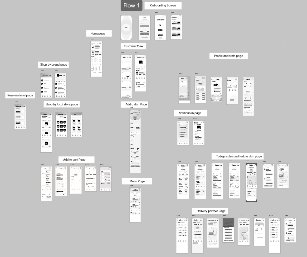
Mid Fi- Wire Flows
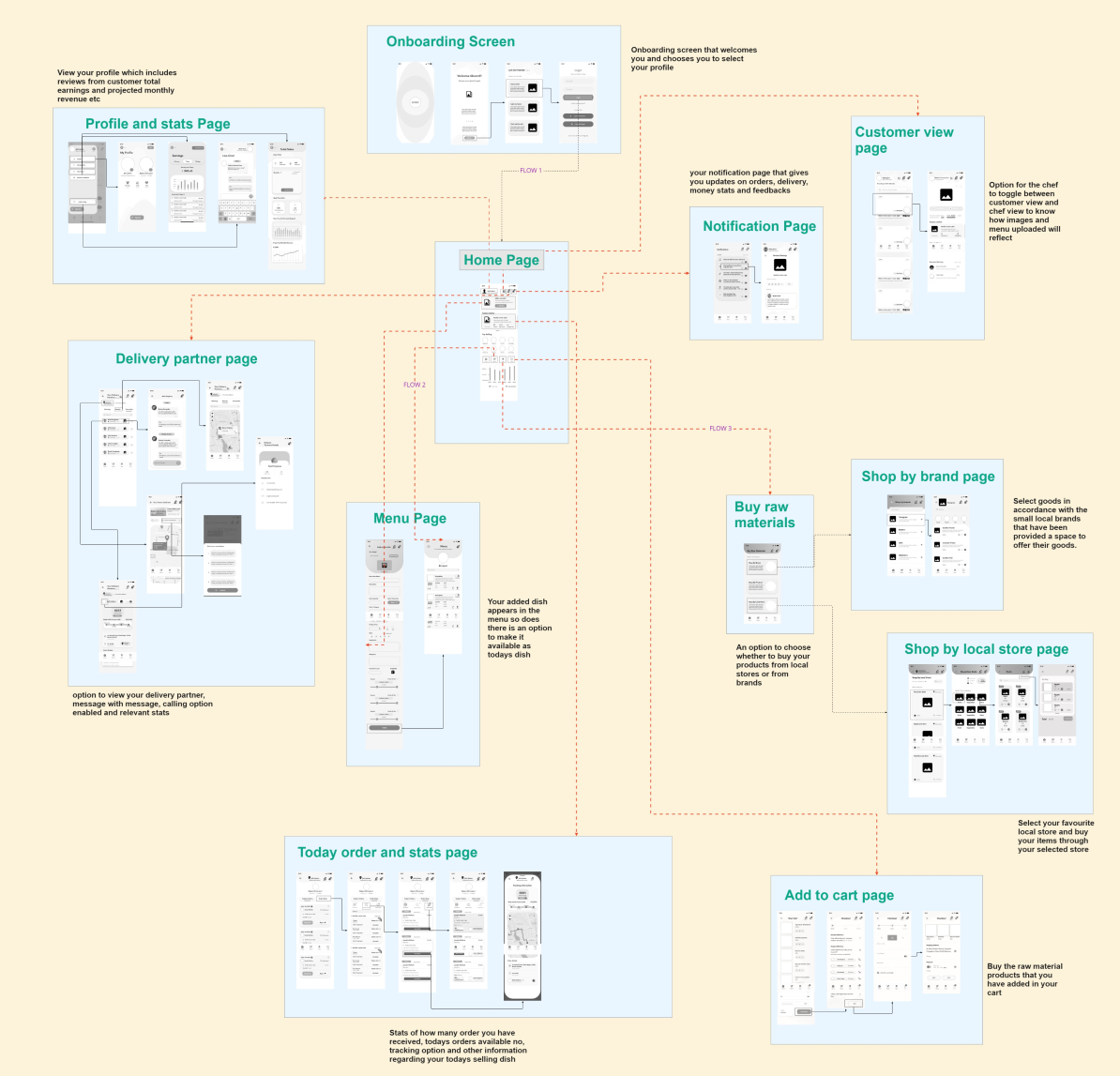
To help users visualise the paths they take, the wire flow was developed as a flowchart. Here is a summary of how users can navigate the application, the route they take to execute a task, and their actual steps.
Mood Board and Logo Design
The brand name was initially chosen as “Food Scheme,” but it was later changed to “Whatscookin” to better reflect the application’s focus on chefs and raw material producers. “Food Scheme” was deemed too vague and not aligned with the application’s intentions and offerings. Several sketches were made on paper to develop an appropriate logo, incorporating elements such as a chef’s hat and door-to-door delivery, symbolizing the delivery of groceries and raw materials. Additionally, a tagline was created: “Whatscookin – where chefs and shops are on the go.”
The brand name was initially chosen as “Food Scheme,” but it was later changed to “Whatscookin” to better reflect the application’s focus on chefs and raw material producers. “Food Scheme” was deemed too vague and not aligned with the application’s intentions and offerings.
Several sketches were made on paper to develop an appropriate logo, incorporating elements such as a chef’s hat and door-to-door delivery, symbolizing the delivery of groceries and raw materials. Additionally, a tagline was created: “Whatscookin – where chefs and shops are on the go.”

Style guide and Components Library
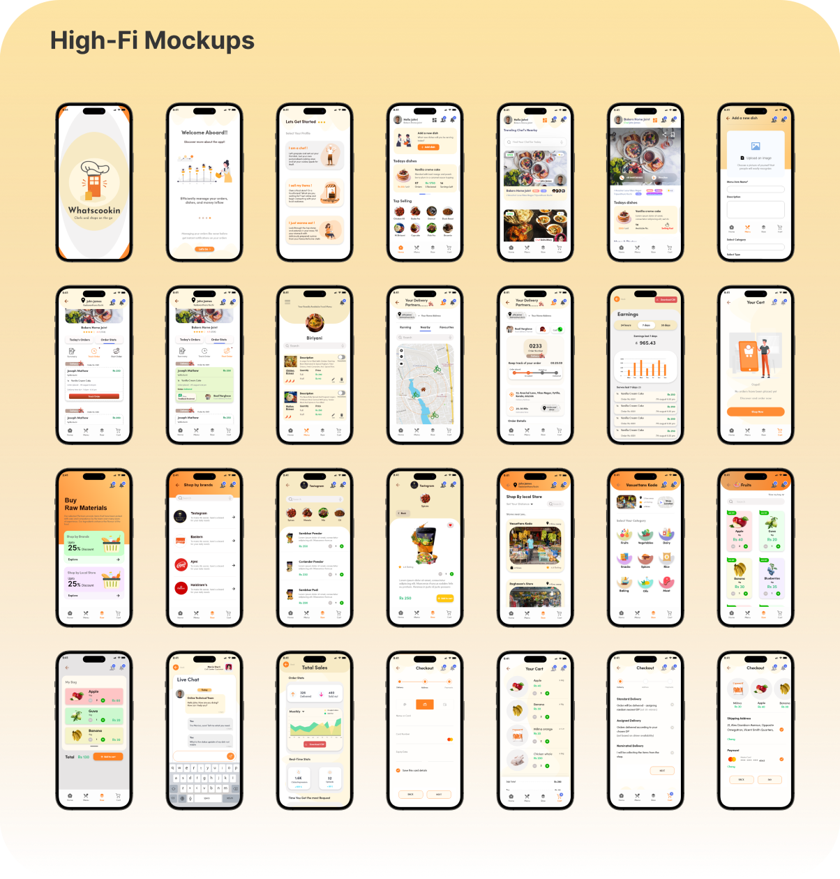
High Fi Prototype
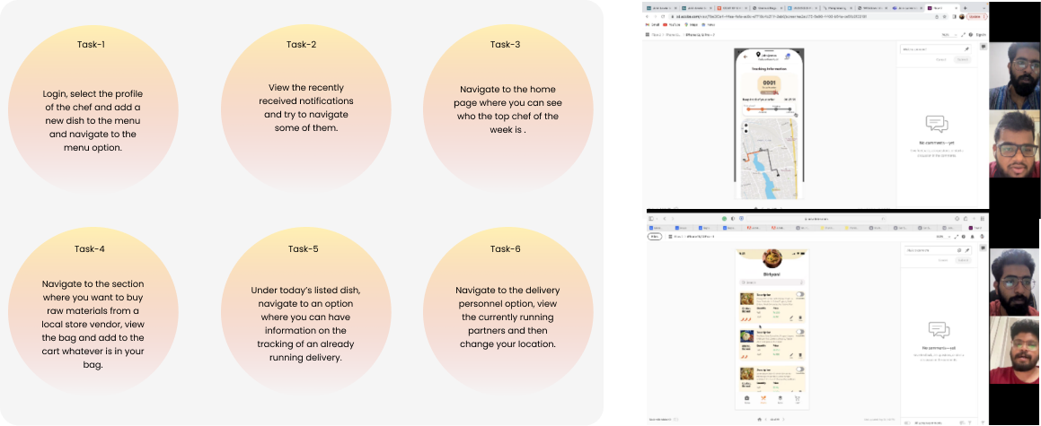
User testing was conducted among six participants, and their insightful comments were recorded. Four tasks were developed to test user interpretation and navigational skills. Essential components, including today’s sales, order stats, summary, adding a dish, viewing the menu, and past orders, have all been taken into consideration and appropriately noted in the task. The user was assessed based on how effectively all the features were used to accomplish the goal and satisfy the task requirements. The app’s design, what it meant, and the participants’ needs were considered while evaluating the participants’ input.
User testing was conducted among six participants, and their insightful comments were recorded. Four tasks were developed to test user interpretation and navigational skills.
Essential components, including today’s sales, order stats, summary, adding a dish, viewing the menu, and past orders, have all been taken into consideration and appropriately noted in the task.
The user was assessed based on how effectively all the features were used to accomplish the goal and satisfy the task requirements. The app’s design, what it meant, and the participants’ needs were considered while evaluating the participants’ input.
Prototype iteration
Prototype iteration
The following design choices were some of the most important ones that needed reconsidering after the test was done and additional reiteration and study were carried out.
‘’Top chef of the week’’ title.
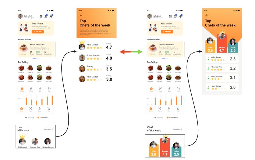
Most of the users had issues with the layout of how the chef of the week title was displayed.
‘’I am a bit confused on what this crown is and what signifies this. I know for a fact that I have I got points and I am crowned which means I am the one leading, but the leader board doesn’t show me any relevant stats as to where I was before and did I overtook someone or not’’.
The red to green arrow points to the screens where a proper leader board-style graph of growth and points earned in accordance with the top chef has been displayed. The user is directed to a screen where the alignment and design layout have been changed after clicking the know more button. Users can now see both the star rating and the points they have racked up over the course of the week, and a more appropriate visual cue has been defined that was previously absent. The entire point of this card was to motivate the chef to work hard and inspire them to differentiate themselves from the top chef’s league, so proper gamification had to be implemented.
Many users had trouble with the layout of the “Chef of the Week” title. One user expressed confusion about the significance of the crown icon and its relation to their points and leaderboard status. They felt the leaderboard lacked relevant stats, such as their previous position and if they had overtaken others.
‘’I am a bit confused on what this crown is and what signifies this. I know for a fact that I have I got points and I am crowned which means I am the one leading, but the leader board doesn’t show me any relevant stats as to where I was before and did I overtook someone or not’’.
To address this, changes were made to the layout and design after clicking the “Know More” button. Users can now see both their star rating and the points earned throughout the week.
Additionally, a clearer visual cue has been added to signify their status. The aim of this update was to motivate chefs, encourage hard work, and foster healthy competition with the top chef, hence the implementation of proper gamification elements.
Buy Raw Material Screen
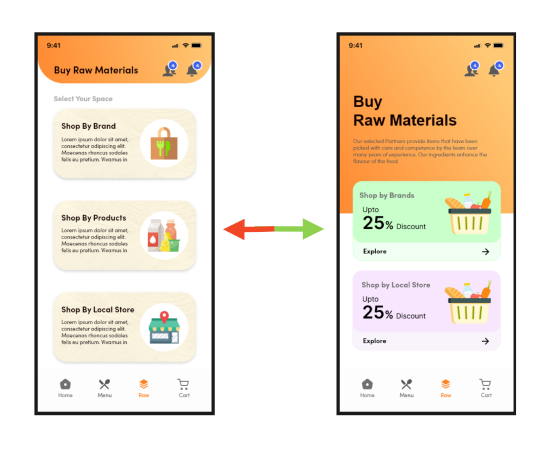
In this section, an extra card labelled “Shop by Products” was initially displayed on the screen. This feature aimed to assist users who preferred not to shop from specific brands or stores. The card allowed users to make purchases even when items were unavailable from the brand or store hubs. However, users faced difficulty navigating this feature due to its design and layout, which lacked visual appeal.
To address this issue, the layout was revamped. Now, only “Shop by Brands” and “Shop by Local Store” options are available. The redesign includes the addition of a discount option and an “Explore More” button to enhance user navigation and make the experience more appealing.
Notification screen
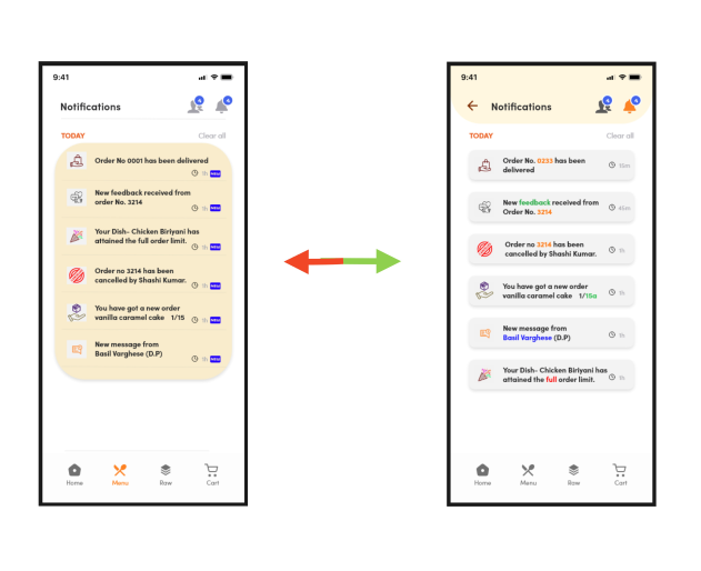
During this stage a major reiteration was carried out by introducing the hierarchy of text and image alignments. The information layered was cluttered together and users had difficulty in selecting the Users click on the button. Onto the reiterated screen a proper segregation and segmentation was layered and information regarding individual notification was given in separate card with enough spacing. Visual cue icons were made minimalistic and proper highlighted texts regarding important information were stressed more clearly.
During this stage a major reiteration was carried out by introducing the hierarchy of text and image alignments. The information layered was cluttered together and users had difficulty in selecting the Users click on the button.
Onto the reiterated screen a proper segregation and segmentation was layered and information regarding individual notification was given in separate card with enough spacing.
Visual cue icons were made minimalistic and proper highlighted texts regarding important information were stressed more clearly.
Home address change screen
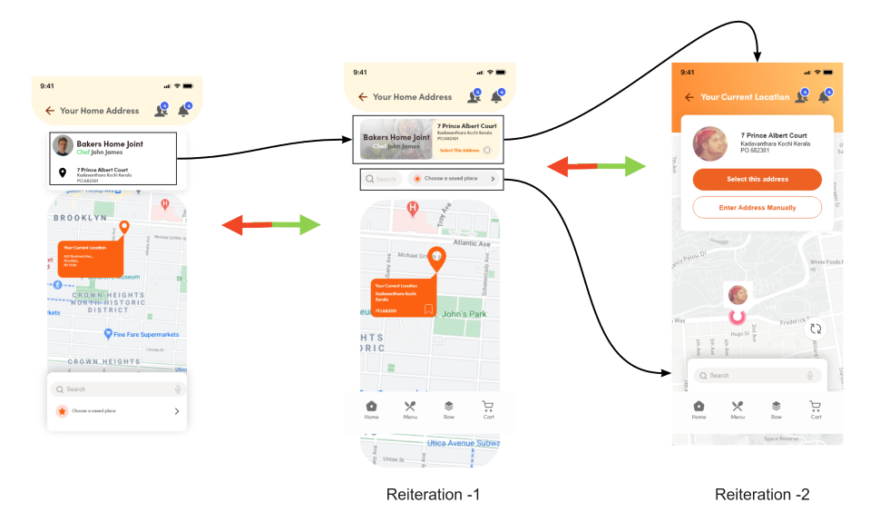
Due of the poor flow in this screen, the reiteration had to be done twice. Most users faced navigational limitations and were stranded on this page during the usability test. They didn’t entirely comprehend how the address was configured, and the information presented was utterly misleading. “For this, a complete restructuring of the screen had to be done. The information was organised more systematically during the initial iteration. However, this created problems with the flow; therefore, it had to be changed once more. This time, Jacobs’s law was applied.
Jakob’s Law stated – ‘’Most users spend their time on other applications. This indicates that they want your application to function like every other application they are already familiar with.’’
Thus, the final modified version was implemented.
Due of the poor flow in this screen, the reiteration had to be done twice. Most users faced navigational limitations and were stranded on this page during the usability test. They didn’t entirely comprehend how the address was configured, and the information presented was utterly misleading.
“For this, a complete restructuring of the screen had to be done. The information was organised more systematically during the initial iteration. However, this created problems with the flow; therefore, it had to be changed once more. This time, Jacobs’s law was applied.
Jakob’s Law stated – ‘’Most users spend their time on other applications. This indicates that they want your application to function like every other application they are already familiar with.’’
Thus, the final modified version was implemented.
Design Rationale
Everyone craves the taste of homemade meals, but in our busy lives, ordering from food delivery services like Just Eat or Uber Eats is often the go-to solution. While eating out is enjoyable, fast food sometimes falls short of satisfying our cravings for home-cooked goodness and cherished memories.
Enter “Whatscookin,” a hyperlocal platform connecting customers with home chefs and cooks eager to share their delicious creations. Unlike typical food delivery apps, Whatscookin focuses on community and empowering home chefs to become successful entrepreneurs.
To encourage the chef to fall in love with the entire process, several aspects that help the chef to acquire an increased level of confidence, and an individually tailored platform with enhanced features has been introduced.
These are as follows
- Adding a completing new dish along with its details
- Stats option showing the number of orders received, cancelled, and finished
- Total sales and earnings collected,
- Impressions, feedback, and reviews obtained,
- Projected revenue in terms of a business model,
- Gamification feature in terms of highlighting the top chef in and around the user’s area
- Location-specific chefs centred around the customer,
- Personalized stats on which dish cooked by the chef is under the top selling tag.
- Once the chef has received an order, to elevate the delivery process better, an entire set of modified delivery personnel has been tailored to meet the chef’s demand. They have options to
- Call, message, or text the delivery partners in terms of a proper communication channel
- Find the local delivery partner available to the nearest location of the chef
- Add a favourite delivery partner who is a trusted partner
- Tracking orders with its updated stages along with in-view map options
Additionally, the app bridges the gap between chefs and raw material producers, empowering small-scale businesses and promoting local brands.


